
When you’re standing in front of your yellow house with its warm brown roof, have you ever wondered what shutter colors would make it truly shine? You’re not alone in this quest for the perfect exterior color combination. Choosing the right shutter color isn’t just about personal preference—it’s about creating a harmonious look that boosts your home’s curb appeal and potentially increases its market value.
As a real estate professional, I’ve seen firsthand how the right shutter colors can transform a property from ordinary to extraordinary. Yellow houses with brown roofs present a unique opportunity to create stunning visual appeal, but they also require careful consideration to achieve the perfect balance.
Understanding Color Harmony for Exterior Design
Let’s dive into the fascinating world of color theory and how it applies to your home’s exterior. Understanding color relationships is the foundation for making wise design choices that will stand the test of time.
The Basics of Color Theory
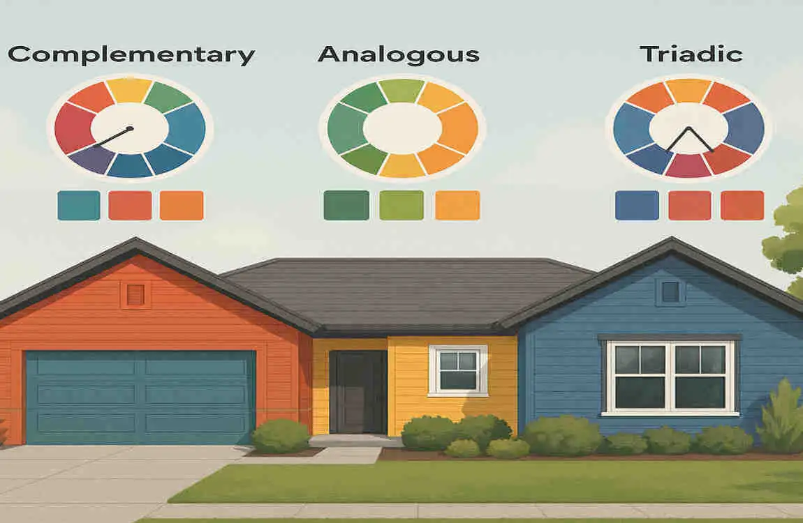
Colors interact with each other in predictable ways. When you look at a color wheel, you’ll notice that colors opposite each other are called complementary colors, while those next to each other are analogous. Yellow sits in the warm section of the color wheel, making it naturally friendly with other warm tones like orange and red, but also surprisingly compatible with specific cool colors that provide contrast.
Your brown roof adds another layer to this color story. Brown is essentially a darkened orange, which means it shares yellow’s warm undertones. This creates a natural harmony that you can either enhance with similar warm colors or balance with strategic cool-toned choices.
The Psychology Behind Color Choices
Colors affect how we feel about spaces, especially in home exteriors. Yellow evokes feelings of happiness, warmth, and welcome—perfect qualities for any home. Brown grounds this cheerfulness with stability and reliability. Your shutter color choice can either amplify these feelings or add new emotional dimensions to your home’s personality.
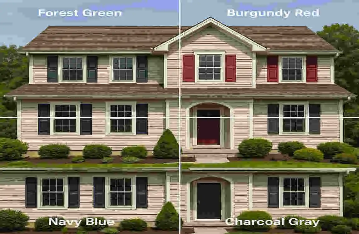
Cool colors like navy blue or forest green can add sophistication and depth to your warm color scheme. They create visual interest by providing contrast while still maintaining overall harmony. Meanwhile, neutral colors like charcoal gray or black add modern elegance without competing for attention.
Creating Visual Balance
The key to successful exterior color design lies in achieving the right balance. Your yellow walls and brown roof already establish a strong, warm foundation. Now, you need to decide whether to continue this warm theme or introduce contrasting elements for visual interest.
Consider the 60-30-10 rule that interior designers love. Your primary house color (yellow) represents 60% of the visual space, your roof and major trim elements (brown) account for 30%, and your shutters and accent details make up the remaining 10%. This formula helps ensure that no single element overwhelms the overall design.
Trending Shutter Colors for Yellow Houses in 2025
The world of exterior design is constantly evolving, and 2025 brings fresh perspectives on classic color combinations. Today’s homeowners are bolder in their color choices while still respecting timeless design principles.
Classic Neutrals That Never Go Out of Style
Let’s start with the tried-and-true options that continue to dominate in 2025. Deep brown shutters create a monochromatic look with your roof, establishing a cohesive appearance that feels intentional and sophisticated. This choice works particularly well for traditional and colonial-style homes where consistency is key.
Charcoal gray has emerged as the new black in exterior design. It offers the sophistication of black but with a softer edge that doesn’t create as stark a contrast against yellow walls. This color choice feels contemporary and fresh while maintaining broad appeal—a crucial consideration if you’re thinking about resale value.
Speaking of black, classic black shutters remain a popular choice for good reason. They create dramatic contrast against yellow walls and work beautifully with virtually any shade of yellow. Black shutters add definition to windows and can make your home appear more substantial and grounded.
Bold Colors Making Waves in 2025
This year, homeowners are embracing color with newfound confidence. Navy blue shutters have become increasingly popular, offering a sophisticated alternative to black while adding personality. The deep blue creates a stunning contrast against the yellow walls without feeling too adventurous.
Forest green is another bold choice gaining traction. This rich, natural color beautifully bridges the gap between your brown roof and yellow walls. It evokes a sense of nature and tranquility while adding unexpected sophistication to your home’s exterior.
For those feeling particularly daring, plum purple shutters offer a unique twist. This unexpected choice works surprisingly well with yellow, creating a complementary color scheme that turns heads for all the right reasons. The key is choosing a muted, sophisticated shade of purple rather than anything too bright or juvenile.
Subtle Pastels and Earthy Tones
The softer side of 2025’s color trends includes beautiful options that add character without shouting. Sage green has become incredibly popular, offering a subtle nod to nature while maintaining sophistication. This muted green works harmoniously with both yellow and brown, creating a cohesive, organic feel.
Soft gray provides a lighter alternative to charcoal, perfect for homes where stark contrast might feel too heavy. This gentle neutral allows your yellow walls to remain the star while adding just enough definition to your windows.
Muted turquoise represents the adventurous end of the subtle spectrum. This unexpected choice adds personality and coastal charm while remaining sophisticated enough for any neighborhood. The key is selecting a grayed-down version rather than a bright, tropical turquoise.
Weighing Your Options
Each color choice comes with its own set of advantages and considerations. Here’s a helpful comparison:
Shutter Color, Visual Impact, Maintenance Level, Resale Appeal, Best For
Deep Brown Cohesive, Traditional Low High Classic homes
Charcoal Gray Modern, Sophisticated Low Very High Any style
Black Dramatic, Timeless Medium High Colonial, Traditional
Navy Blue Bold, Elegant Medium High Cape Cod, Coastal
Forest Green Natural, Rich Medium Moderate Craftsman, Ranch
Sage Green Subtle, Organic Low High Modern Farmhouse
Matching Shutter Colors with Different Shades of Yellow
Not all yellows are created equal, and the specific shade of yellow on your house significantly impacts which shutter colors will look best.
Pale Yellow Houses
If your home features a soft, buttery yellow or cream-colored exterior, you have incredible flexibility with shutter colors. Pale yellow acts almost like a neutral, allowing both bold and subtle shutter colors to shine.
For these lighter yellows, consider deeper shutter colors that provide clear definition. Charcoal gray or navy blue shutters create a beautiful contrast without overwhelming the gentle nature of pale yellow. These darker colors frame your windows elegantly and add visual weight to your home’s facade.
Alternatively, soft sage green or muted turquoise can create a dreamy, cottage-like appearance that feels fresh and inviting. These colors work particularly well if you’re aiming for a coastal or farmhouse aesthetic.
Golden Yellow Houses
Golden yellow homes radiate warmth and sunshine. This rich, saturated color calls for shutters that can hold their own without competing. Deep brown shutters create a luxurious, monochromatic look that emphasizes the warmth of your home.
Black shutters provide classic contrast against golden yellow, creating a look that’s both traditional and striking. The key is ensuring your black isn’t too harsh—consider a soft black or off-black that maintains sophistication without creating jarring contrast.
For a more unexpected approach, plum purple or deep burgundy shutters can create a regal appearance. These colors share red undertones that complement golden yellow beautifully while adding a unique personality to your home.
Mustard Yellow Houses
Mustard yellow presents unique challenges and opportunities. This earthy, complex color works best with shutters that respect its sophisticated, muted nature. Forest green shutters create a natural, grounded look that feels intentional and harmonious.
Charcoal gray provides a modern counterpoint to mustard yellow’s vintage charm. This combination feels fresh and contemporary while maintaining the warmth that makes yellow houses so appealing.
Consider warm white or cream shutters for a softer approach. While light shutters on a yellow house might seem counterintuitive, they can create a cohesive, tonal look that feels sophisticated and intentional.
How to Complement a Brown Roof with Shutter Colors
Your brown roof plays a crucial role in your home’s color story. Understanding how to work with this element rather than against it will help you achieve a cohesive, professional-looking exterior.
The Impact of Roof Color on Design Choices
Brown roofs come in various shades—from light tan to deep chocolate—and each variation affects your shutter color options differently. Lighter brown roofs offer more flexibility, allowing for both light and dark shutter choices. Darker brown roofs tend to look best with shutters that provide some contrast to prevent the top of your house from feeling too heavy.
Think of your roof as an anchor that grounds your home’s color scheme. It provides a stable foundation that your shutter color can either echo or contrast with, depending on your design goals.
Creating Unity Through Color
One practical approach is to choose shutters that bridge the gap between your yellow walls and brown roof. Colors with brown undertones, such as deep olive green or warm gray, naturally harmonize with both elements. These transitional colors create flow and prevent any element from feeling disconnected.
Another strategy is to select shutters with the same color temperature as your roof. Since brown is warm, warm-toned shutters like deep red, burnt orange, or golden bronze can create a cohesive palette. However, don’t feel limited to warm colors—cool-toned shutters can provide refreshing contrast when chosen carefully.
Finish Considerations
The finish of your shutters affects how they interact with your brown roof. Matte finishes tend to look more traditional and blend seamlessly with the natural texture of roofing materials. They’re also practical, as they hide imperfections and require less frequent cleaning.
Glossy finishes add a touch of elegance and can make colors appear more vibrant. They work particularly well with darker shutter colors, adding depth and richness. However, they do require more maintenance and can show wear more readily.
Consider a semi-gloss finish as a happy medium. This option provides some shine without being overly reflective, offering durability and visual appeal that works well with most roof types.
Design Tips for Highlighting Architecture Using Shutter Colors
Your shutters do more than add color—they’re architectural elements that can enhance or diminish your home’s best features. Strategic color choices can highlight beautiful windows, balance proportions, and create visual interest.
Accentuating Architectural Features
Use your shutter color to draw attention to your home’s best features. Dark shutters create frames around windows, making them appear larger and more prominent. This technique works exceptionally well for homes with interesting window shapes or arrangements.
If your home has decorative trim, choose a shutter color that complements it without competing with it. A color that’s too similar might make everything blur together, while one that’s too different could create visual chaos.
Consider the scale of your shutters relative to your windows. Larger shutters can handle bolder colors without overwhelming the facade, while smaller shutters might benefit from more subtle choices that don’t dominate the visual space.
Balancing Bold Choices
When selecting a bold shutter color, remember that a little goes a long way. The 10% rule mentioned earlier becomes even more critical with dramatic colors. Your shutters should enhance, not dominate, your home’s appearance.
Create balance by repeating your shutter color in small doses elsewhere on your exterior. Your front door or garage door trim could echo the shutter color, creating a cohesive look without overwhelming the eye.
Mixing Traditional and Modern Elements
2025’s design trends embrace the mixing of traditional and contemporary elements. Classic shutter styles in unexpected colors create an interesting tension that feels fresh and current. Consider traditional louvered shutters in a modern charcoal gray, or sleek board-and-batten shutters in a classic forest green.
The key to successful mixing lies in maintaining consistency in either style or color. If you choose modern shutter styles, stick with them throughout. If you opt for an unconventional color, ensure all your shutters match perfectly.
Maintenance and Practical Considerations for Shutter Colors
While aesthetics are important, practical considerations should also influence your shutter color choice. Different colors require varying levels of maintenance and can affect your home’s energy efficiency.
Heat Absorption and Fading
Darker colors absorb more heat, which can cause shutters to warp or fade more quickly, especially in sunny climates. Black and dark brown shutters may require more frequent repainting or replacement. However, modern paint technology has improved significantly, with many manufacturers offering fade-resistant formulas specifically designed for exterior use.
Lighter colors reflect heat and tend to show less fading over time. Sage green and soft gray shutters maintain their appearance longer but may show dirt and mildew more readily, requiring more frequent cleaning.
Material and Finish Durability
The best shutter material depends on your climate and maintenance preferences. Composite shutters offer excellent durability and hold paint well, making them ideal for any color choice. Vinyl shutters are low-maintenance but may have limited color options and can become brittle over time.
Wood shutters provide authentic charm and can be painted any color, but they require regular maintenance to prevent rot and warping. Consider your long-term maintenance commitment when selecting both the material and the color.
Case Studies: Successful Examples from 2025 Renovations
Let’s look at real-world examples of homeowners who successfully transformed their yellow houses with brown roofs by strategically choosing shutter colors.
The Classic Colonial Transformation
A homeowner in New England updated their pale yellow colonial by installing deep charcoal-gray shutters and a medium-brown roof. The previous white shutters had blended too much with the light yellow, making the house appear washed out. The new gray shutters added definition and sophistication, dramatically increasing the home’s curb appeal.
The impact was immediate and measurable. Photos show that the darker shutters created visual anchors, making the windows appear larger and more prominent. The homeowner reported multiple compliments from neighbors and a noticeable increase in the property’s assessed value.
The Bold Craftsman Update
A craftsman-style home in California featured golden-yellow siding and a dark brown roof. The owners took a risk by choosing forest green shutters, moving away from the safe but predictable black shutters that previously adorned the windows.
The green shutters bridged the warm and cool tones beautifully, creating a sophisticated palette that felt both classic and contemporary. The color choice emphasized the home’s connection to its natural surroundings, with mature trees framing the property. This renovation demonstrates how bold decisions can pay off when thoughtfully executed.
The Coastal Cottage Refresh
A beach community home with mustard-yellow siding and a light-brown roof underwent a stunning transformation with muted turquoise shutters. This unexpected choice could have been risky, but the homeowners selected a grayed-down turquoise that complemented rather than competed with the existing colors.
The result was a home that felt fresh and coastal without being cliché. The subtle turquoise added personality while maintaining sophistication, proving that unconventional choices can work beautifully when properly executed.